SACE, the certificate South Australian students finish school with, is trialling a new idea: alongside their subjects, students are rated on five capabilities, like quality thinking and collective engagement. I joined the trial as its only designer for five weeks, owned the student side end to end, and kept the teacher tool in step. In that time the work went from blank service blueprints to a design system, three ideas for picturing growth ready to test, and two working prototypes on phone and desktop.
ClientSACE Board of South Australia
RoleProduct Designer (sole designer, contract)
TeamProgram team, education consultants and a lead software engineer
Services
Service DesignProduct DesignDesign SystemsAccessibilityPrototypingResearch Planning
PlatformsWeb, phone and desktop
Year2026
The brief
In the trial, teachers and VET trainers rate students on five capabilities: collective engagement, personal enterprise, principled action, quality thinking and self-motivated learning. Each capability breaks into parts, like adapting or being responsible, and each part is rated on what a teacher actually saw a student do.
The idea isn’t new. SACE has been shaping it for about five years, through research and a running log of decisions about what the profile should and shouldn’t be. I joined partway through, taking over from another designer, so my first job was to catch up on that history and keep what still held, rather than start the thinking again.
The ratings needed somewhere to go. The student side, a profile where a student sees what their teachers noticed, sets a direction and shares it with someone who matters, was mine to design. The teacher side already existed as a prototype, and I was asked to keep it in step.
It was a pilot, with real students and teachers ahead of it, so everything had to be testable rather than pretty pictures. I built both prototypes in working code, on phone and desktop, from the second week on. Every student in them is made up. The one you’ll see throughout is Mia, starting Stage 1 in the second semester of 2026.
Five weeks, week by week
I joined on 8 October and finished on 13 November. The short version is below. Each week built on the one before, and nothing waited for a big reveal.
Read everything, then map it
Five years of program history: the original requirements, four pilots, the decision log and the drafts I inherited. I started the student and teacher service blueprints from a blank page, and gave the teacher tool a design system foundation and an accessibility pass.
Two service blueprints started
Teacher tool design system
SA Gov accessibility pass
Hear people out, find a look
One-to-ones across the program team, each one to hear their view rather than pitch mine. Out of those came the rules the student side lives by, and a first draft of Collected, the design system. Three ideas for picturing growth went into Figma side by side.
Collected design system draft
Three ideas in Figma
Teacher dashboard with one main action
From Figma to working code
With the three ideas locked, I started the student prototype in Next.js, built to match Figma on phone and desktop. Signing in, drawing a portrait, the tour and results day came first, because that is the order a student meets them.
Student prototype started
Onboarding for all three ideas
Sharing as a conversation piece
What happens after results day
Goals, the Scout helper, the student's own notes and Explore, a tab that puts jobs and courses next to the capabilities a student has shown. On the teacher side, a new way to rate with a summary, comments and keyboard shortcuts.
Goals and Scout
Explore
New teacher rating flow
Check it works for everyone
A screen reader and WCAG 2.2 audit of both prototypes, fixed in both codebases. Research plans for three rounds of testing, with a session tool built into the prototype. The teacher tool got its proposed name, Capabilities Online.
Accessibility audit and fixes
Research plans and session tool
Capabilities Online brand
Show it, then hand it over
A walkthrough for the program team, with a showcase page in each prototype so anyone can try the key moments without a guide. Then the handover: a decision log, codebase guides, both design systems and the research plans, ready for whoever picks it up.
Showcase pages
Program team walkthrough
Handover pack
Pick a week, or use the arrow keys.
Mapping the service first
Before drawing a single screen, I needed to know what the whole thing was. I read five years of program history and met the program team one to one, each time to hear their view rather than pitch mine. Then I built two service blueprints from scratch, one for students and one for teachers, across a full school year.
The blueprints set a few rules that later shaped the product. A lane only holds what that person can actually see, so if a student can’t see something, like a teacher rating them, it goes behind the scenes. An empty cell says ‘Nothing to see yet’ instead of being filled to look busy. And plain words throughout, so the blueprint can be read by a principal as easily as a developer.
A simplified slice of the student service blueprint. Pick a stage to see the decision behind it.
Stage
What the student does
Joins a class session on what the five capabilities mean
Adds a note about a moment, if they want to
Opens their profile when the semester locks in
Picks one part to work on, with Scout to help think if they like
Picks who it's for and up to three parts to talk about
What they can see others do
Their teacher walks the class through it, in plain words
Nothing to see yet
What their teachers saw, shown as stars, pieces or beads
A teacher can tap ‘Worth aiming for’. No approval step.
The person they show sees released results only
Behind the scenes
School · enrols the class and names a mentor
School · teachers and VET trainers rate each part of a capability Data in
SACE · ratings checked and combined Data crunch
School · the mentor sees goals the student chooses to share
SACE · the shared view is served from SACE's records Data out
Kick-off. Schools choose how they run this. The blueprint suggests a session at the start of each year, not a rule.
During the semester. An empty frontstage cell stays empty on purpose. If a student can't see something, it doesn't belong in their lane.
Results day. This is the moment the whole service builds to, so it gets the one big celebration and the one foil accent.
Set direction. Goals are optional, can change any time and never carry streaks or counters. A profile is complete without one.
Share it. Sharing works any time, not just at the end of school. A part-time job interview at 16 counts.
A reflection tool, not a report card
The trial’s biggest risk was never technical. It was a 16-year-old opening an app and feeling measured. The question I kept the whole design to was simple: show how a student is good, not how good a student is.
That one sentence ruled a lot out. No progress bars, no scores, no ticks, no rankings and no comparison with other students, anywhere. Instead, each part is described as something the student did, who saw it replaces how much, and the student’s own words sit beside the teacher’s without ever changing a rating.
Same student, same ratings
Flip it and see what a student would feel
MiaRank 14 of 28
Collective engagement3.4 / 5
Quality thinking2.1 / 5
Principled action3.9 / 5
Overall progress 63% · Below class average
Numbers and scores turn a description of someone into a grade.
Progress bars say the job is unfinished, forever.
Ranks and averages invite the comparison this program set out to avoid.
Mia, so far
Demonstrating respectCollective engagementSeen by two teachers
AdaptingQuality thinkingSeen by one teacher so far
Being responsiblePrincipled actionSeen again this semester
“I stayed calm when my surf club group disagreed, and let everyone have a say.”Mia's own note
Each part is described as something the student did, in “you” sentences.
Who saw it replaces how much: one teacher, two, seen again.
Their own words sit beside the teacher's, dotted so it's clear whose they are, and never change a rating.
Three ideas, one set of flows
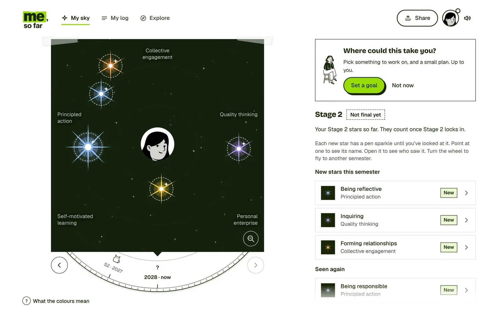
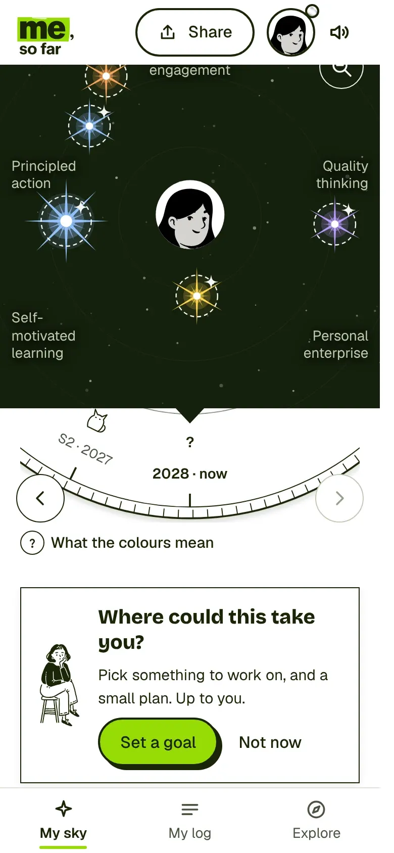
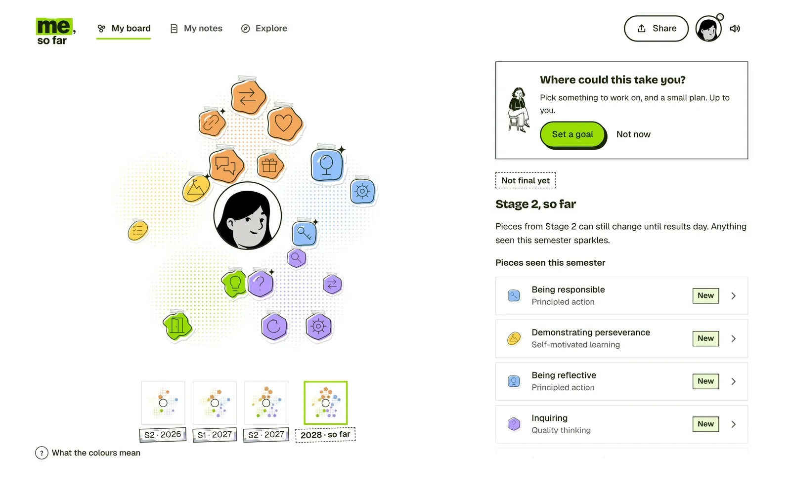
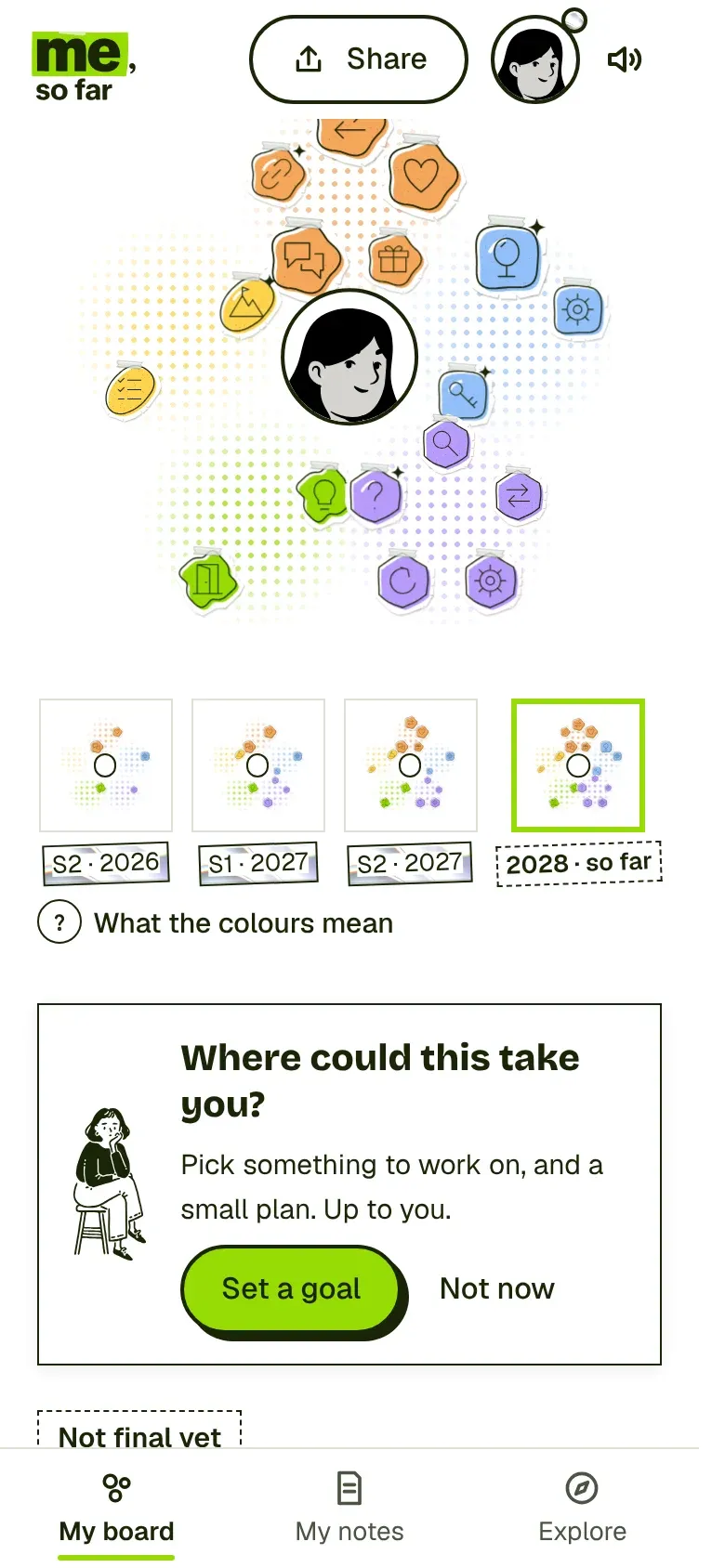
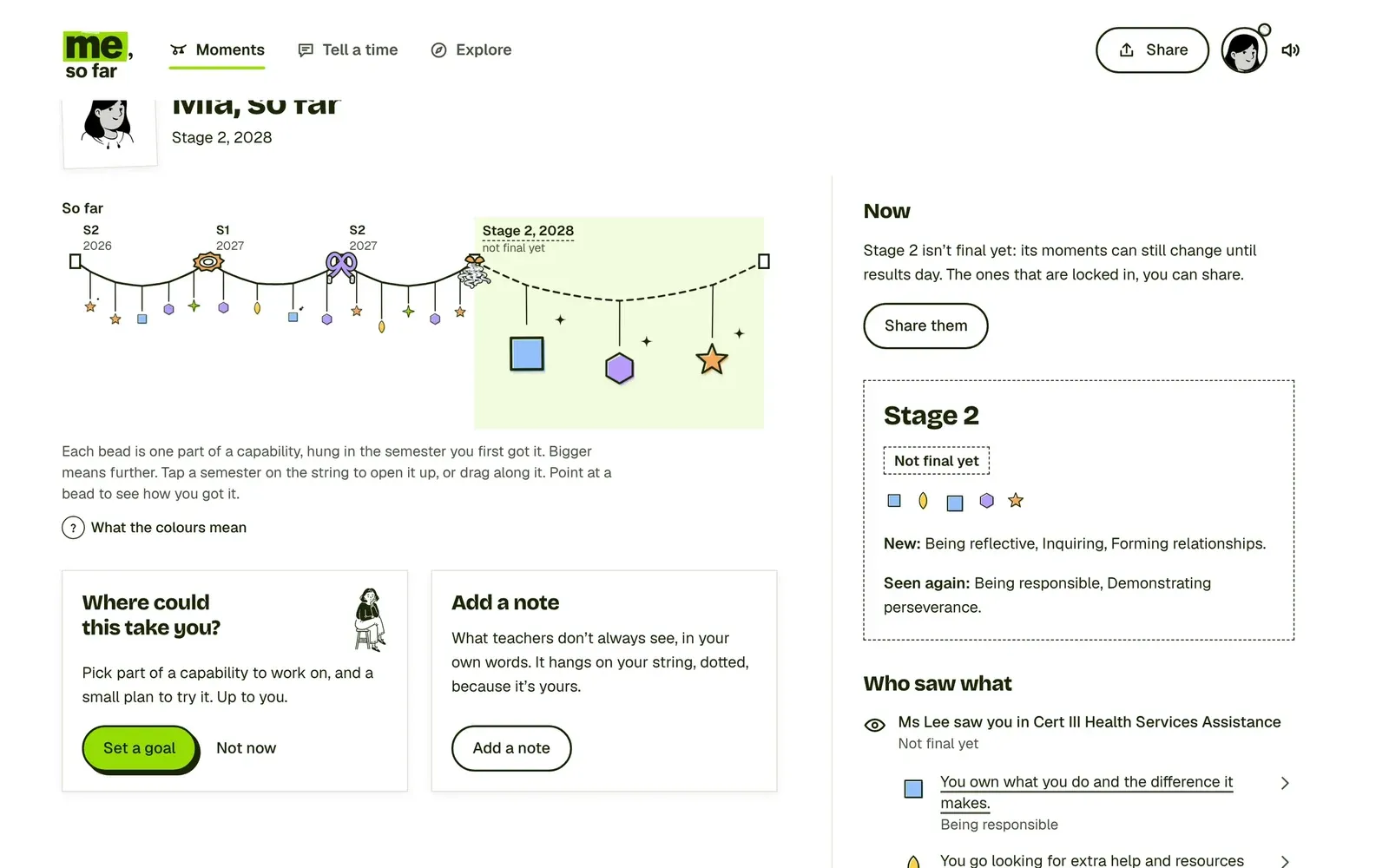
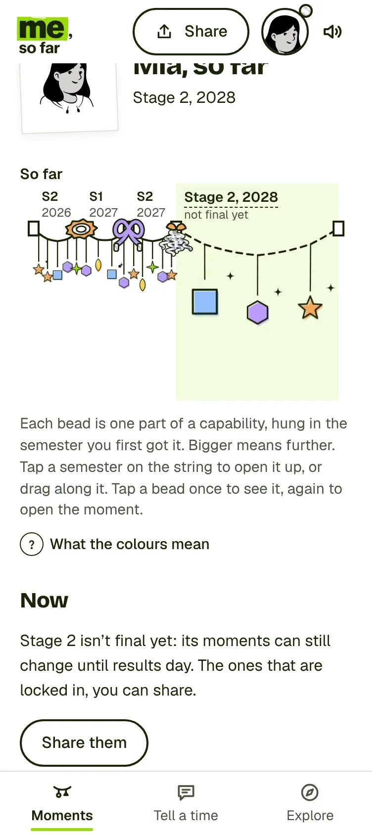
A capabilities profile has no obvious shape, so I designed three ways to picture growth and built all three. Open Sky is a night sky where each part a teacher saw is a star. Keepsakes is a board of hand-cut pieces taped around the student’s portrait. Your moments is a string of beads, hung in the semester each part first showed up.
The rule that made three ideas affordable: they share every flow. Signing in, results day, notes, goals, sharing and Explore are the same steps with the same words in all three. Only the picture, the tab names and where each flow ends change, and those live in one place in the code. That’s what lets a research session compare the ideas fairly, and what let one designer build all three.
Shared by all three:Signing inPortrait and tourResults dayNotesGoals and ScoutSharingExploreWords and data
The picture of growth
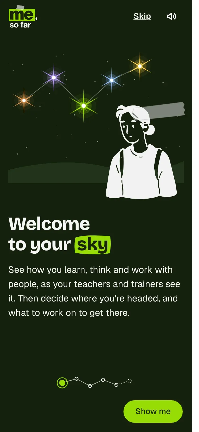
Each part a teacher saw is a star in your own sky. Bigger means they saw you go further. A wheel underneath flies you back through every semester.
How it feels
Calm, a bit cosmic, made for looking back at night.
Its own tabs
My sky · My log · Explore
Where every flow ends
Your sky, with the newest stars sparkling until you've looked
The picture of growth
Each part is a hand-cut piece taped to a board around your portrait. Seen again, it grows. A strip of past boards shows how it stood each semester.
How it feels
Tactile and collected, like a pinboard in your room.
Its own tabs
My board · My notes · Explore
Where every flow ends
Your board, with this semester's pieces listed beside it
The picture of growth
Each part is a bead, hung on one long string in the semester it first showed up. Every semester stays on the string, and the one you're in opens up wide.
How it feels
A story told in order, closest to a diary.
Its own tabs
Moments · Tell a time · Explore
Where every flow ends
The whole string, each finished semester tied off with its own bow
Collected, the design system
Teenagers can spot an adult trying to look young from a mile off, so the look had to come from things they already make and keep: riso prints, hand-cut paper, clear tape, ink drawings, a bit of holographic foil on something special. I called the system Collected.
It’s built on SACE’s own design system underneath, with the same base colours, spacing and focus styles, so it belongs to the family. Then it adds rules for how much ink goes where: light on screens you read, more on the student’s own pages, most on results day. Never behind text, never on a button, never on anything that could read as a rank.
Colour
Five capabilities, five inks
Each capability has four tones. The paints are bright, so on white they only reach 1.3 to 2 to 1 contrast. The fix came from riso printing: every paint shape gets an ink outline, with the paint printed slightly off the line.
Open doors You chase ideas, make your own path and get things done.
Pale#e4f6b8Tints behind ink text
Paint#97dc06Shapes, always with an ink outline
Punch#3f8f00Lines and small marks
Deep#2b5200Text on a pale tint
Stretch minds You look past the facts, stop to think and ask why.
Pale#ece3ffTints behind ink text
Paint#b99afcShapes, always with an ink outline
Punch#7444f0Lines and small marks
Deep#4a22b0Text on a pale tint
Share success You connect with people who see and do things differently, and share the wins.
Pale#fde5cfTints behind ink text
Paint#f5a65bShapes, always with an ink outline
Punch#d4580aLines and small marks
Deep#8a3a06Text on a pale tint
Embrace perspectives You think about what your actions mean for others, and respect difference.
Pale#e0edfeTints behind ink text
Paint#93c0faShapes, always with an ink outline
Punch#2f6fe8Lines and small marks
Deep#1d4aa3Text on a pale tint
Strengthen ownership You own your learning, know your strengths and treat a mistake as a first try.
Pale#fdf1c4Tints behind ink text
Paint#fcd34dShapes, always with an ink outline
Punch#d99a00Lines and small marks
Deep#7a5600Text on a pale tint
Type
Three voices, one job each
Your results are in
Bricolage Grotesque ExtraBold for the one big title on a screen, with one word on the lime marker.
See how you learn, think and work with people, as your teachers and trainers see it.
Geist for everything you read. 16px and up, sentence case, no spaced-out capitals.
Own it when I say yes.
Instrument Serif italic only for words the student wrote, like a goal. It tells you whose words they are.
Materials
Paper, tape, ink and one bit of foil
Hand-cut paper taped onto plain white, ink-drawn people, and one iridescent accent per big moment. Each material means one thing, so students learn to read them.
SheetWhite, a 1.5px rule, a soft lift. Never a tone change.
Every card is the same paper.
“I kept going on the history essay when I wanted to quit.”
Dotted edge means the student's own words.
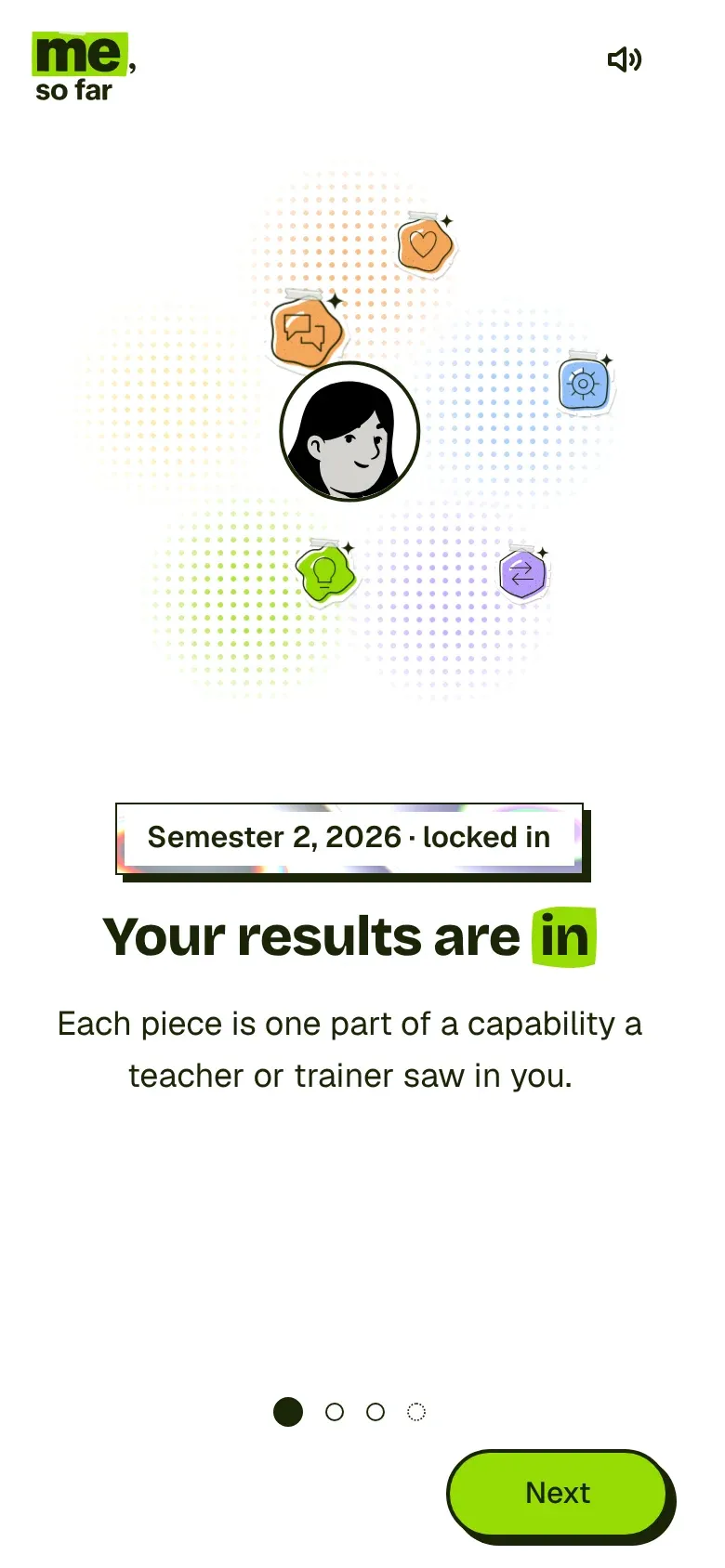
Semester 2, 2026 · locked in
Foil frames, never fills. Words stay on white, so they pass contrast.
Next
Lime with an ink offset for the one main action.
The flows
Every flow runs end to end on phone and desktop, from the first button to its end state back at home, with no dead ends. Here are five of them, each in its own words.
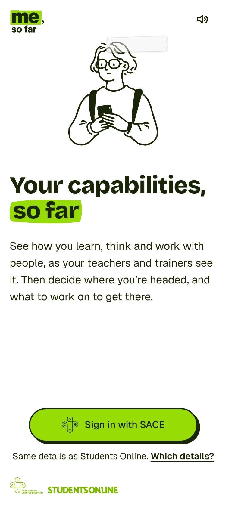
Sign in with the details students already use for SACE, then make it yours before any results arrive.
No new account. The same details as Students Online, with a page that explains which ones.
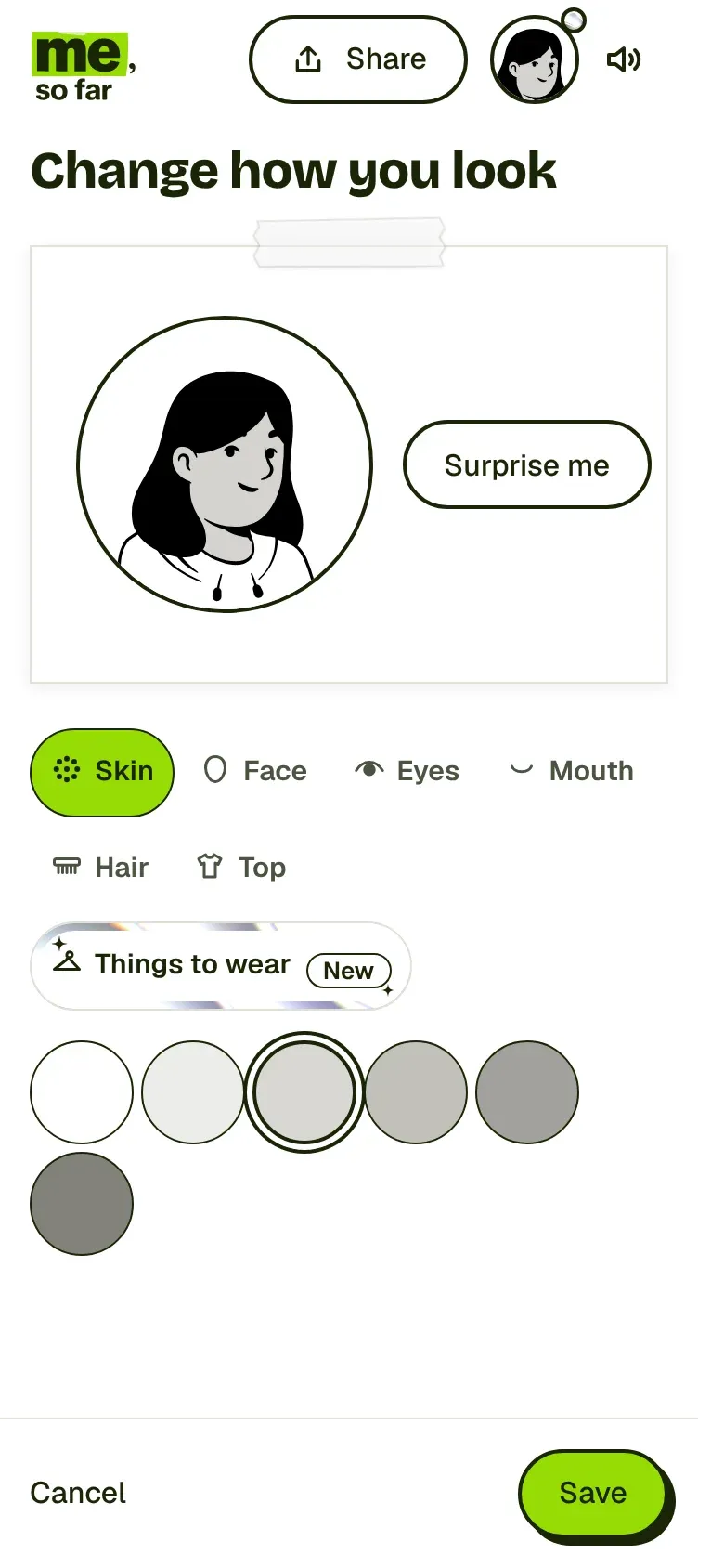
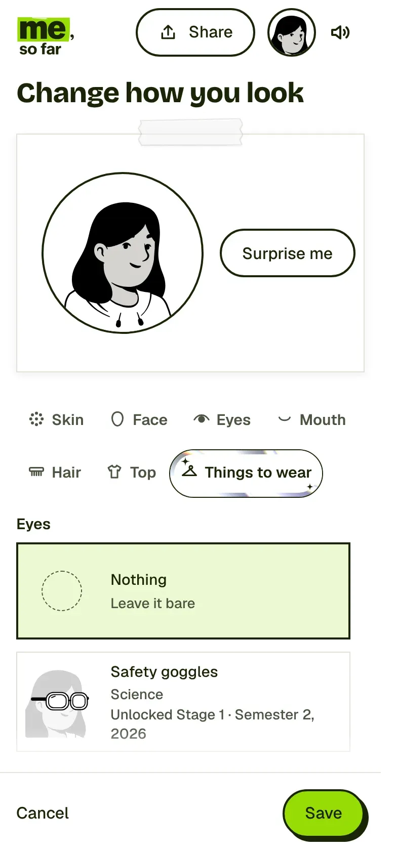
A portrait is optional. Initials are a first-class choice, and drawing yourself has inclusive hair and head coverings.
Your first thing to wear, a SACE lanyard, arrives on day one, so the profile has something of yours before a single rating.
A short tour you can skip, then results day: the semester locks in with one sound, one bit of foil and one big moment.
1Welcome
2Draw yourself
3Things to wear
4Tour
5Results day
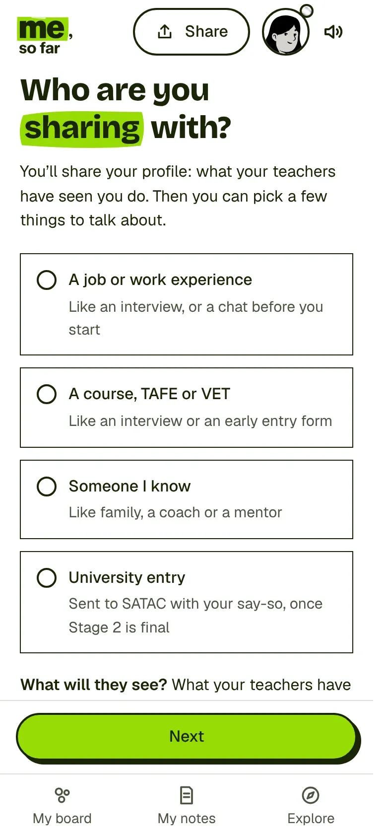
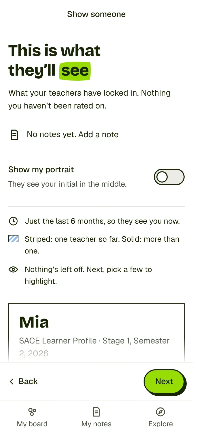
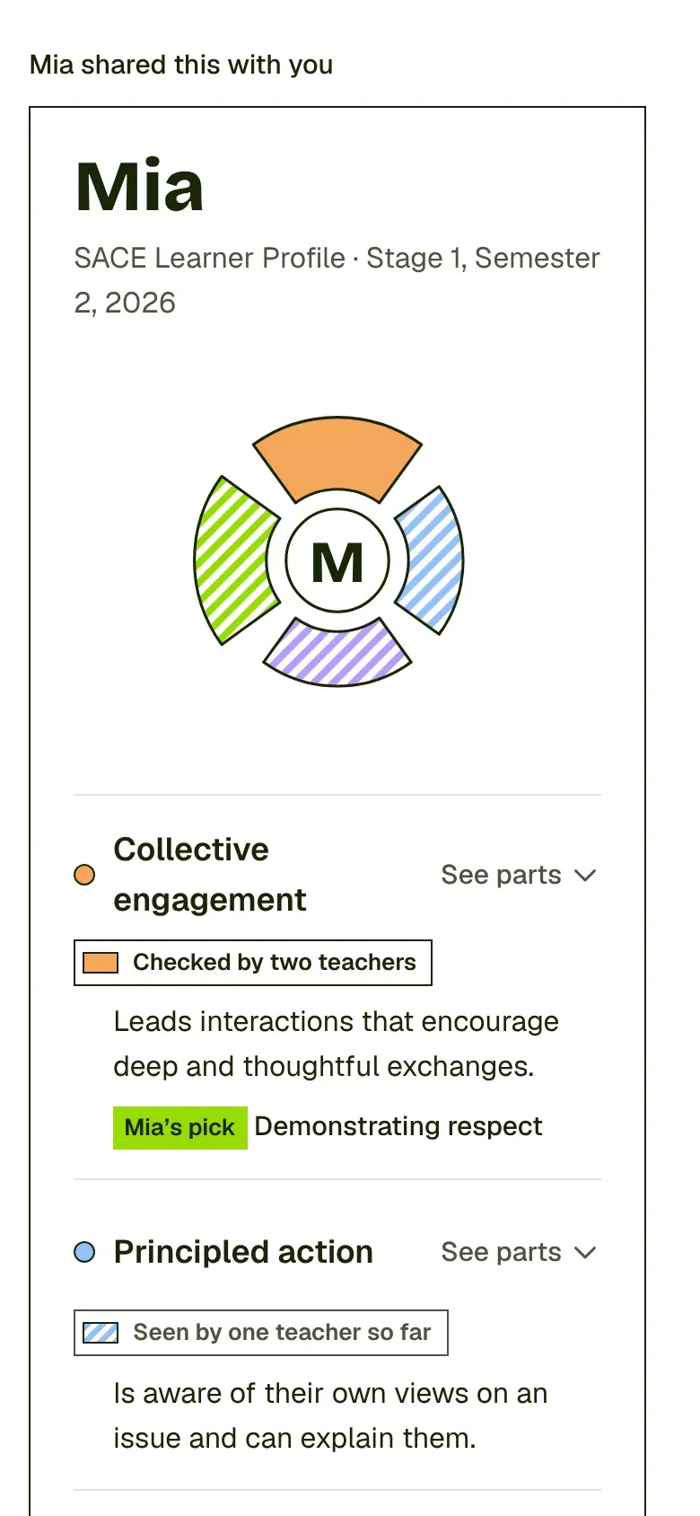
A profile is only useful if it starts a conversation, so sharing is built for one: an interview, an application, a chat with a coach.
Start with who it's for. A job, a course, someone you know, or university entry, and each changes what's shown.
Pick up to three parts to talk about, then see exactly what they'll see before anything leaves.
Show it on your screen or send a link or QR code. Only released results, never anything unrated.
The shared page is serious and practical on purpose. The playful look stays in the student's own space.
1Who's it for
2What they'll see
3Their view
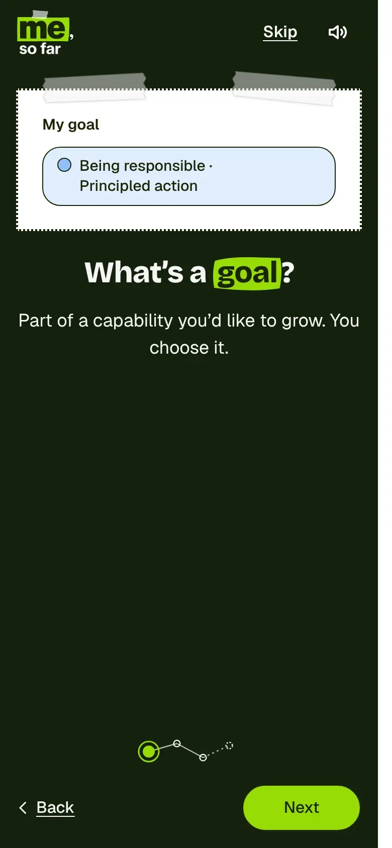
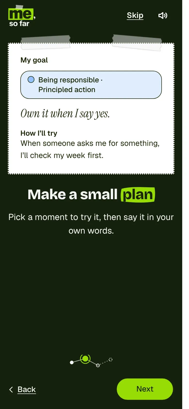
Pick one part of a capability to grow, and a small plan. Up to you.
Optional, changeable and never permanent. A profile is whole without a goal, and there are no streaks or counters.
Plans are written as ‘When…, I'll…’, the shape research says people actually follow through on.
Scout, an AI helper, works by picking first and typing last. It helps a student form their own idea, never decides for them, and every step points back to a real person.
At most one gentle nudge a semester, at a good moment like results day, with a ‘Not now’ that's respected.
1What's a goal
2A small plan
3Back home
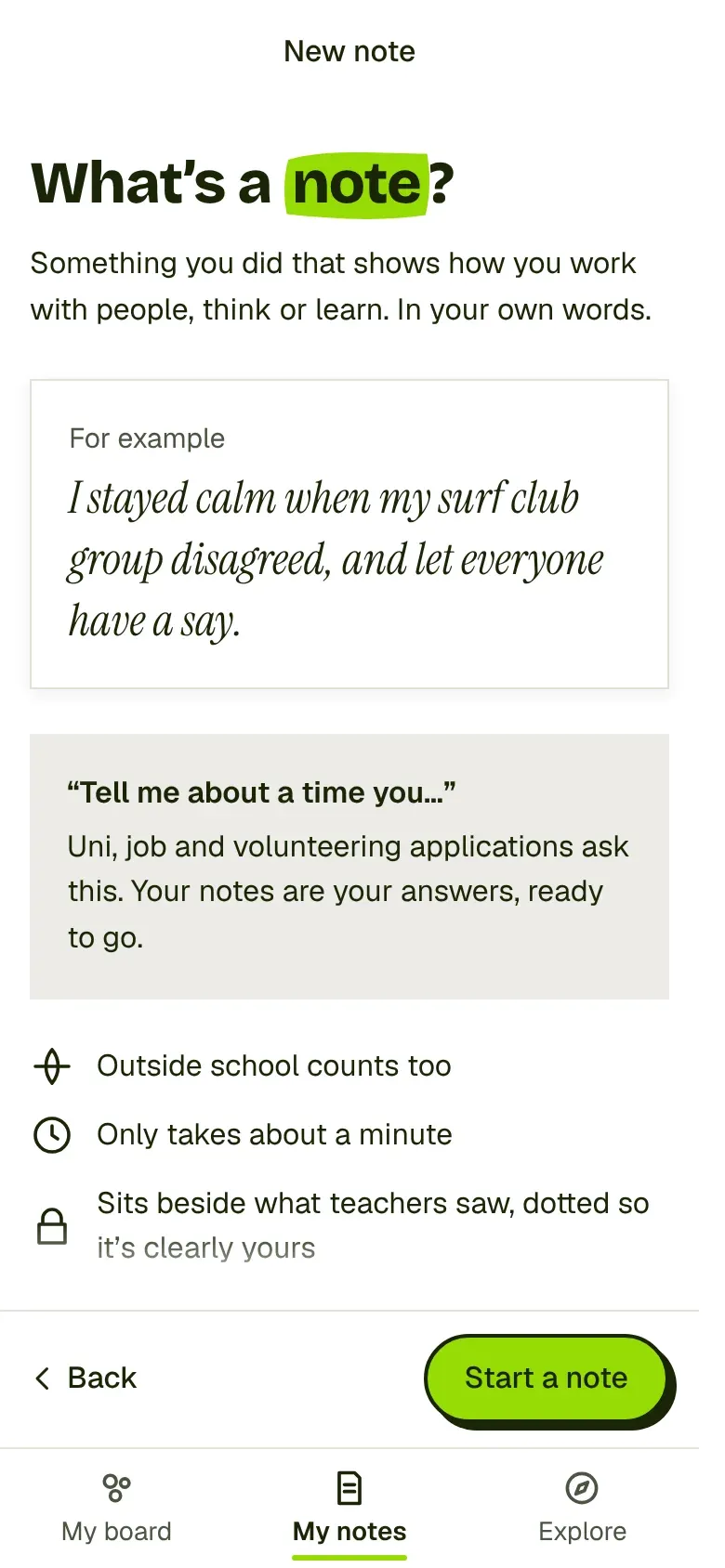
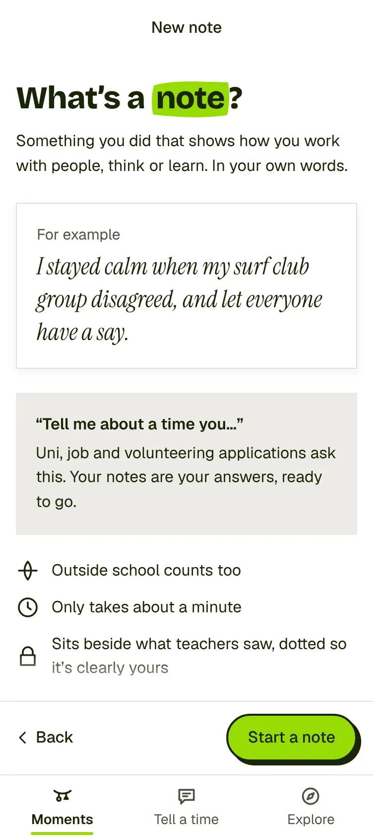
This is the self-assessment: not rating yourself, but saying what happened in your own words.
A note is something you did that shows how you work with people, think or learn. Outside school counts too.
Picking comes before typing, so a blank box never stares back.
Notes sit beside what teachers saw, dotted so it's clear they're yours, and never change or average into a rating.
Each idea names them its own way: My notes, My log, or Tell a time.
1Keepsakes
2Your moments
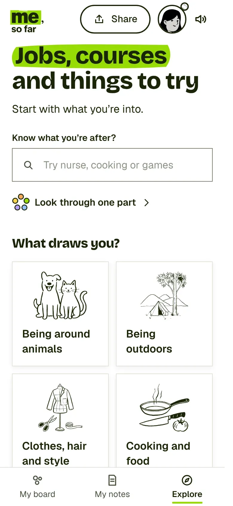
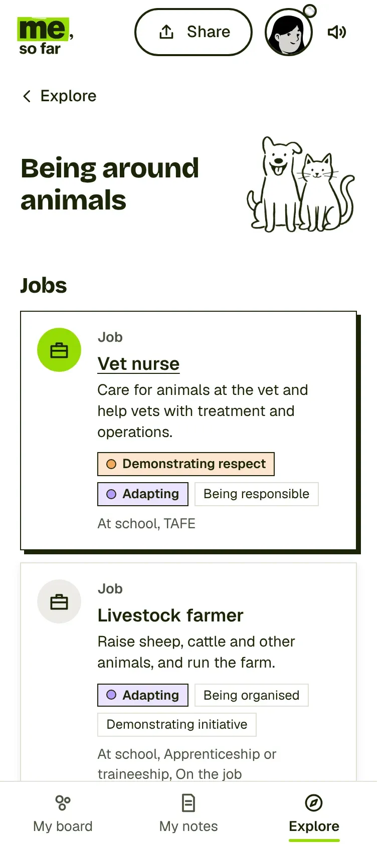
Capabilities only matter if a student can see where they lead, and that's not only jobs. Courses, teams and life at home count too.
Start with what you're into, not a career test: being around animals, cooking, gaming, helping people.
Each idea lists jobs and courses with the parts of capabilities they use, and marks the ones the student has already shown.
A one-part lens works across all of Explore. ‘Everything that uses your capabilities’ was dropped, because it lit up nearly everything.
From any idea, ‘Make it a goal’ starts the goal flow with the idea as the reason why.
1What draws you
2One idea
Capabilities Online, the teacher side
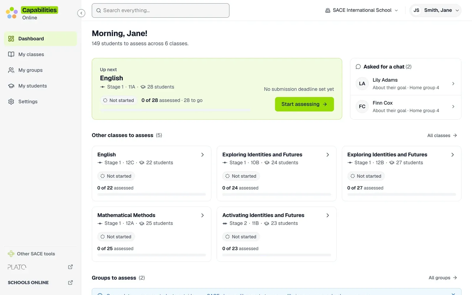
The teacher tool is where the data comes in, so it has to be fast, calm and hard to get wrong. Early on, I gave it a design system foundation with shared tokens and components, and made the dashboard about one thing: the class to assess next.
The bigger change was how rating works. Teachers now rate one student at a time, one part of a capability per screen, with the capability’s meaning beside them, a comment if they want one, keyboard shortcuts for every option, and a summary before moving to the next student. I kept whole-class rating off any single screen on purpose: a grid of 28 names invites rating the class rather than the person.
Later I proposed a name for it, Capabilities Online, to sit beside Schools Online and Students Online, so the tool wouldn’t be confused with the program. Its mark is the five capability colours in a ring.
The dashboard leads with one thing: the class to assess next.
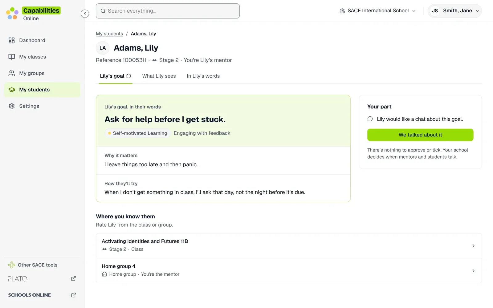
A mentor sees only the goal a student chose to share, and can mark that they talked about it.
Accessible from the first screen
Students will open this on school laptops and their own phones, some with a screen reader, so both prototypes are built to WCAG 2.2 AA and the South Australian Government’s accessibility toolkit, and checked against both at phone and desktop widths.
In week five I audited both prototypes properly: an automated crawl of every screen at both widths, scripted keyboard focus tests, and reading the accessibility tree the way a screen reader would. Then I fixed what it found in both codebases. A few of the findings were the kind no checklist catches.
936
page views checked by an automated crawl, across both prototypes
390 + 1440
every screen at phone and desktop width
48px
the smallest tap target, to SA Government mobile guidance
4.5:1
the least contrast for any text, so words never sit on paint or foil
What the screen reader pass found
Focus vanished on step changesMoving between steps of a flow dropped keyboard focus to the top of the page. Steps now keep focus where the person is.
Toasts nobody heardA ‘Saved’ message that rode along to the next page was never read out, because a live region only speaks about changes after it appears.
Ratings that moved on silentlyAfter a teacher rated a part, the next question appeared but a screen reader didn't say so. Focus now lands on the new question.
Words on foilIridescent foil can't hold a contrast ratio. Every foil element became a frame with white inside, so text always sits on white.
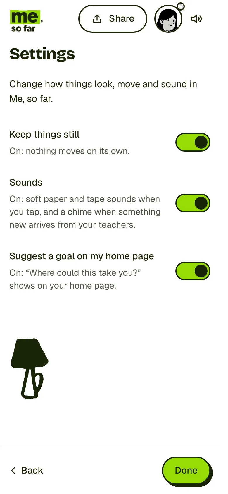
Keep things still stops every animation in the student app, on top of the system setting. This page has one too.
A research plan, ready to run
The three ideas were built to be tested with students before anyone picked one. I wrote the research plans for two rounds, and built the tools to run them into the prototype itself: a student screen that only ever shows the student their task, a separate notes window for the facilitator with the script, and a record of taps and pauses, never typing.
Testing hadn’t started by the time I finished, so there are no findings here. What I handed over is the plan, the run sheets and a prototype ready for the first session.
The plan I handed over
Not run
PilotOne session to test the run sheet itself, not counted.
Round 1Three schools, small groups of friends who pick each other. All three ideas, in rotated order, then reactions from teachers, VET trainers, employers and universities.
Between schoolsFix only what blocks a session. Design changes wait, so every school sees the same thing.
Round 2Quick checks one to one, a class round where each student works alone, then an ease-of-use test with five tasks.
How sessions would work
Point and explainAfter each task, students point at what they'd show someone and say why, in their words. It shows what they understood without a quiz.
Which would you back?Each student splits $100 across the three ideas, turn by turn, so the loudest voice doesn't set the answer.
A listener that changesThe same question asked as if to a parent, then a coach, then a friend, to hear how a student would explain it to each.
A harm checkEvery plan watches for one thing above all: does this show how a student is good, or how good a student is?
Handing it over
Five weeks is a short time to own something this size, so I planned the ending from the start. Both prototypes have a showcase page that opens each key moment with Mia’s made-up profile set up for it, so the program team can show the work without me in the room.
The handover pack covers the decisions and why each was made, with dates and who set them, a guide to each codebase, both design systems, the service blueprints and the research plans. ‘Me, so far’ and ‘Capabilities Online’ are working names I proposed, not names students or teachers know yet. Whatever the trial decides to keep, it starts from something that works.
Results
5 weeks
blank page to two prototypes
3 ideas
sharing one set of flows, on phone and desktop
936
page views audited against WCAG 2.2 AA and the SA Government toolkit